Final Clock 1
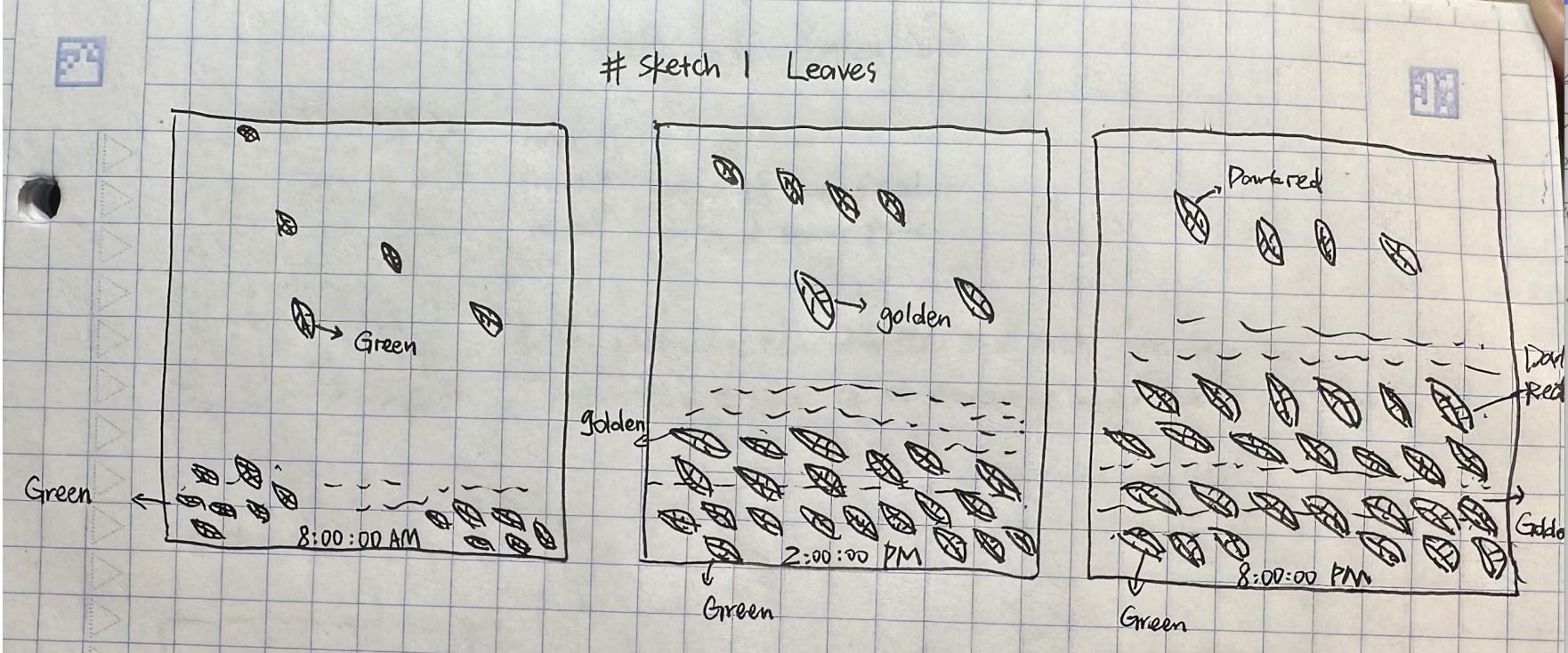
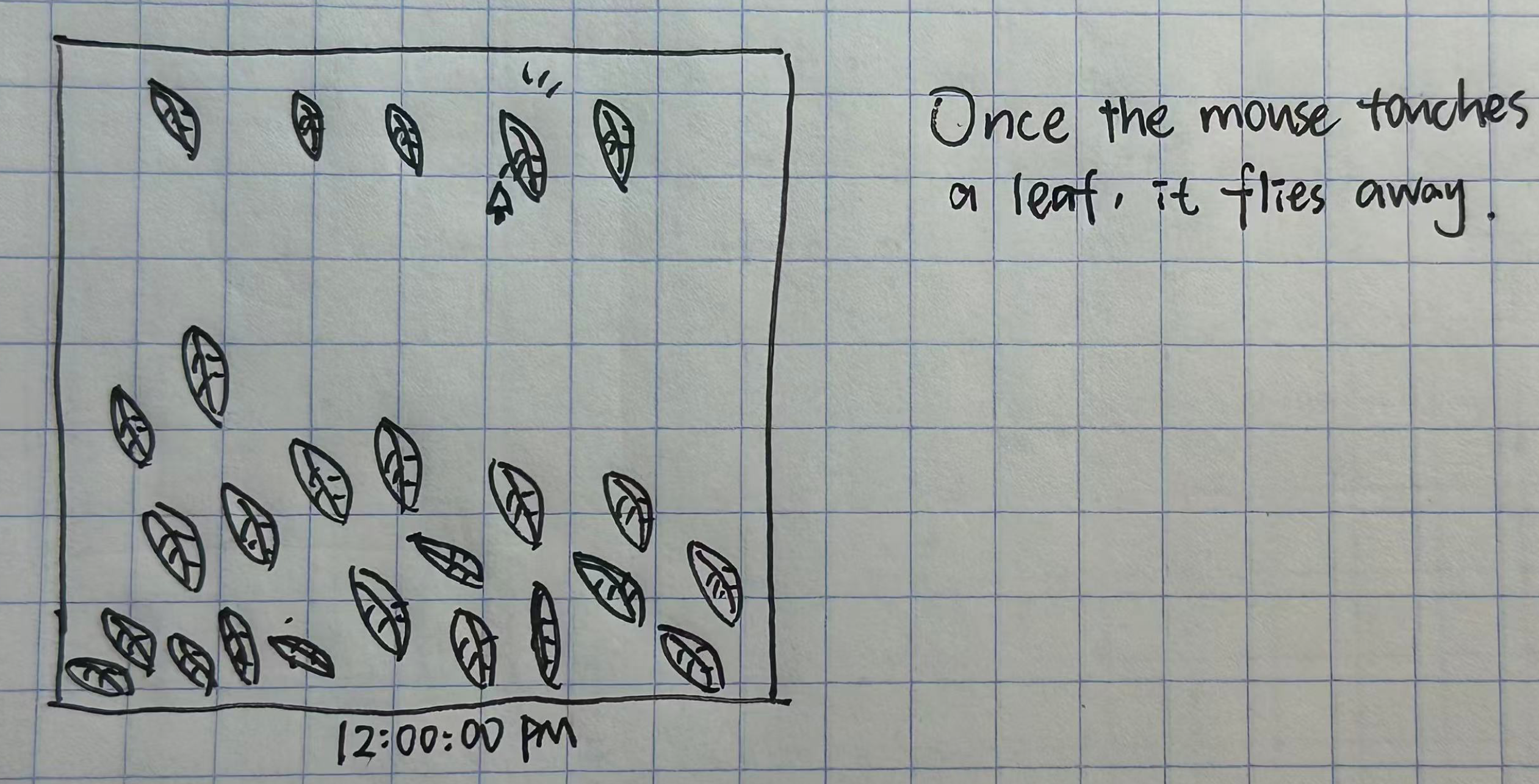
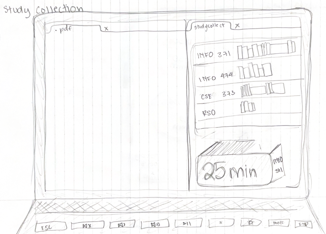
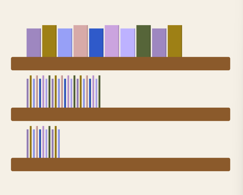
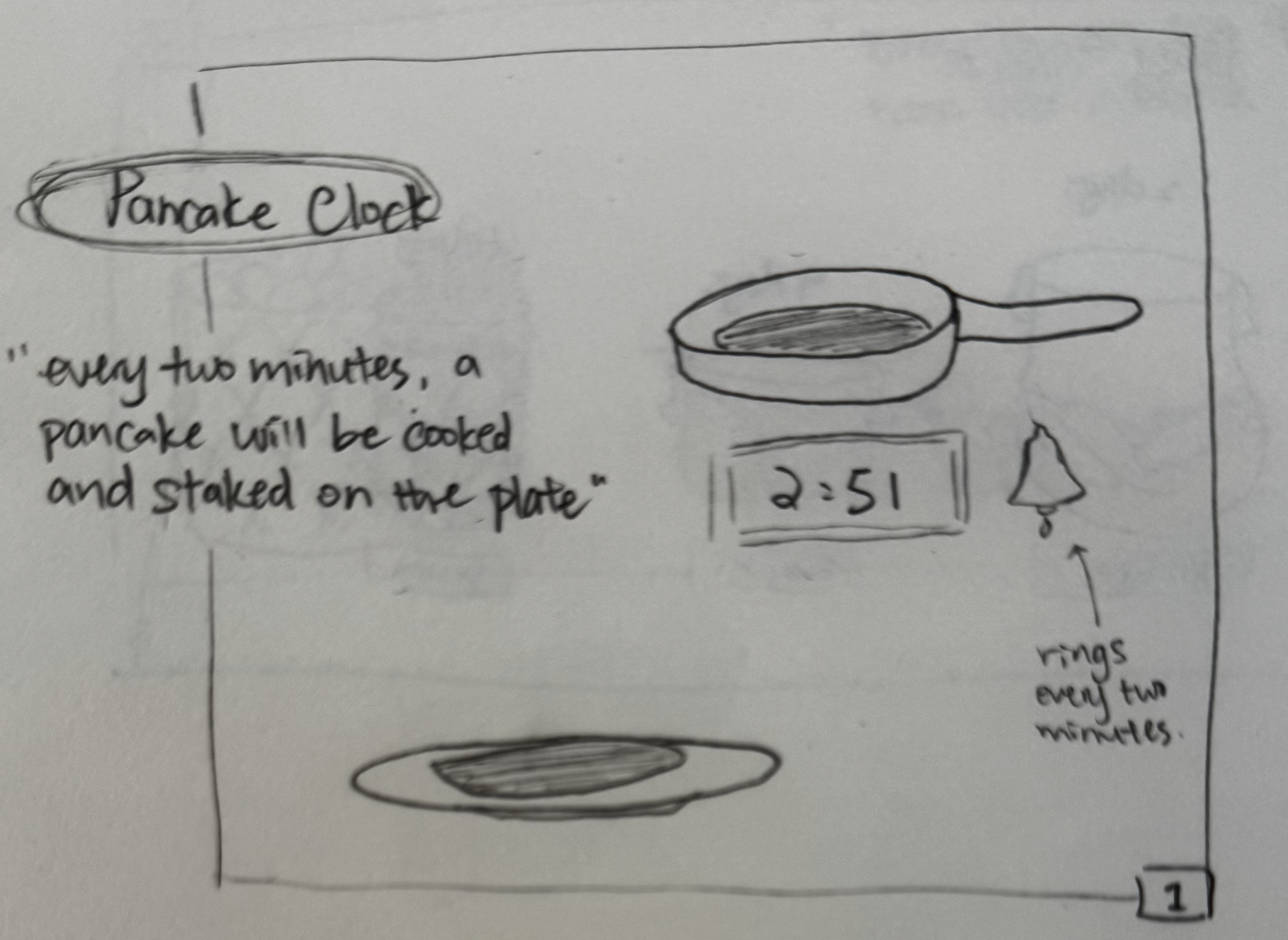
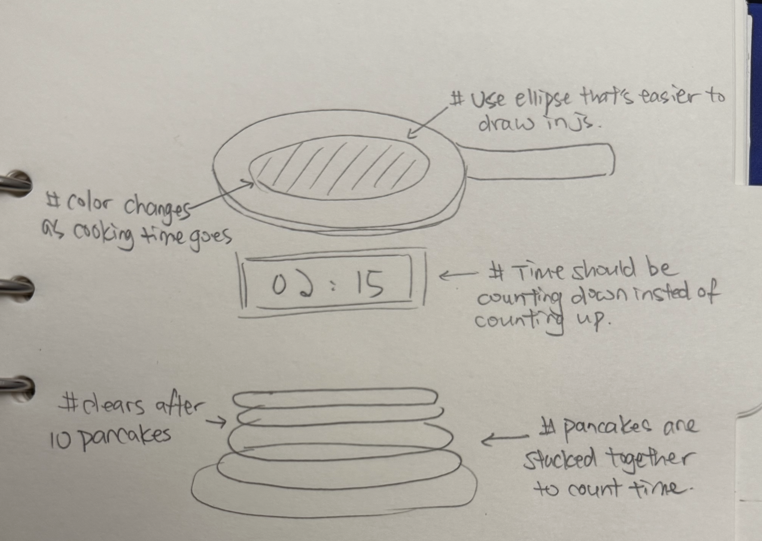
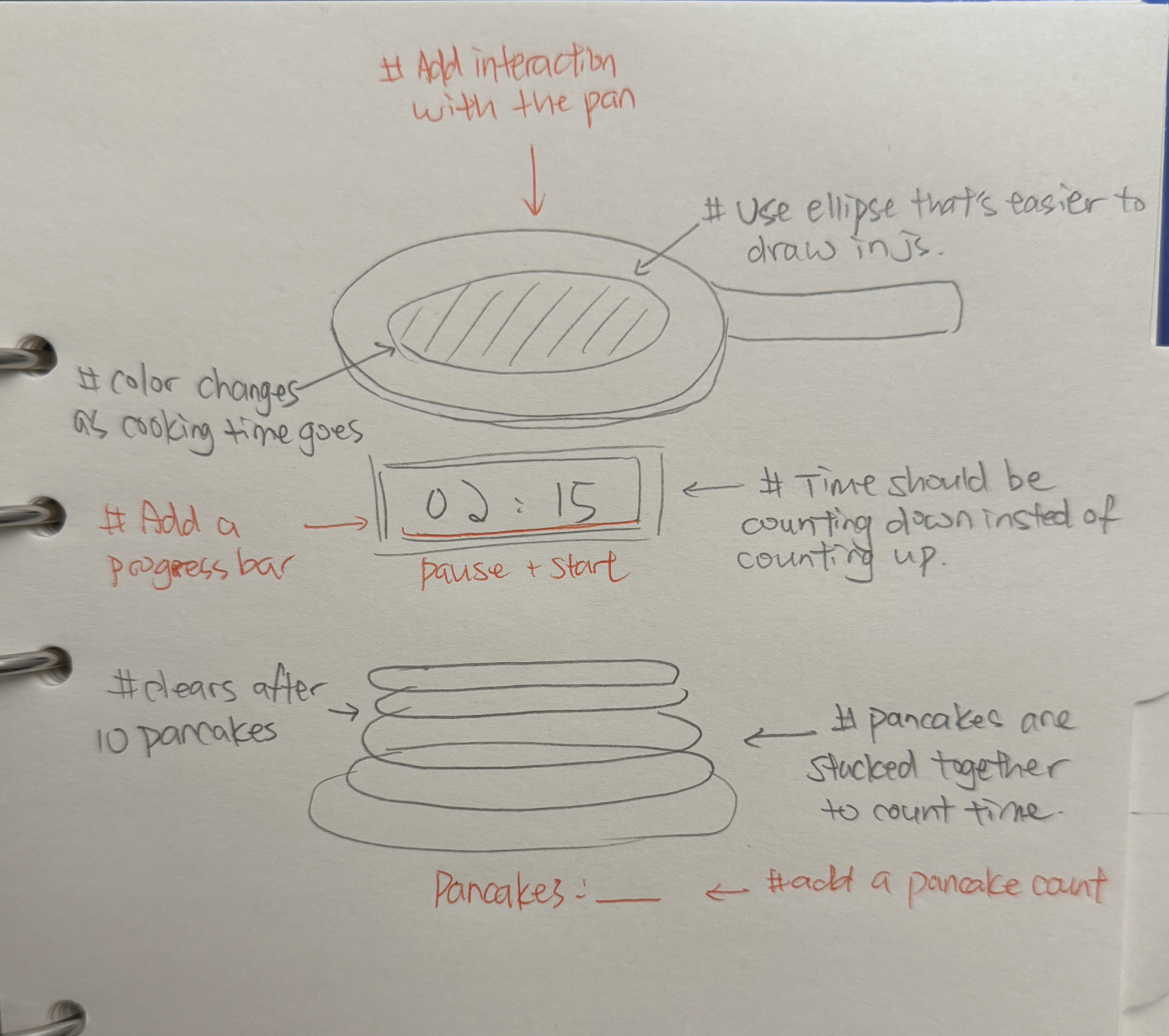
Sketch iteration documentation (paper/hand-drawn photos)
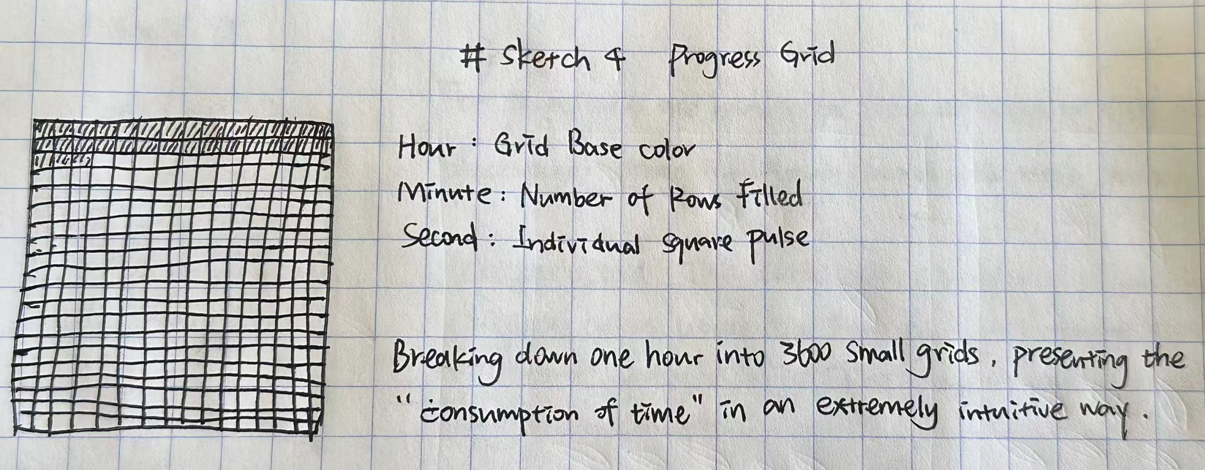
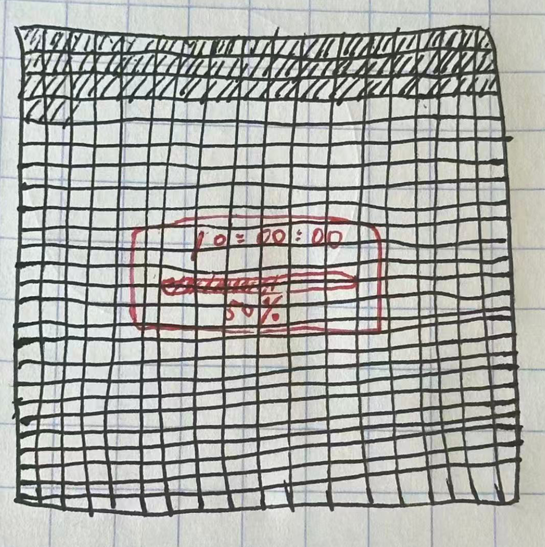
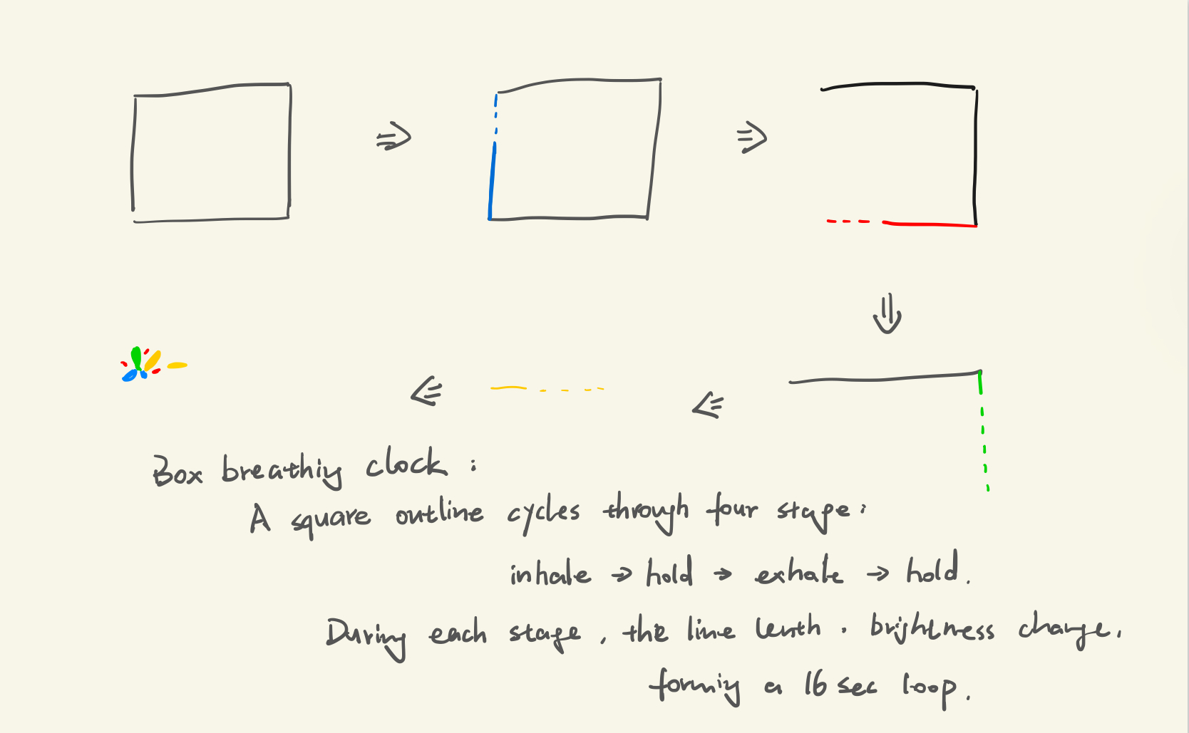
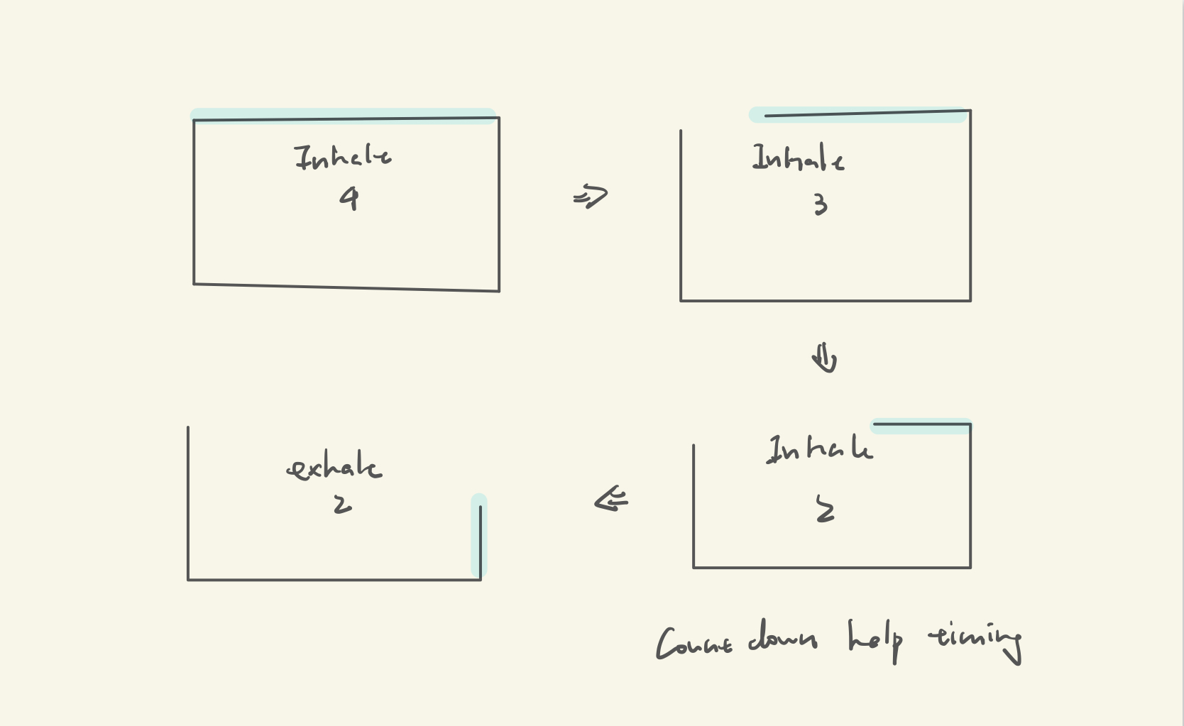
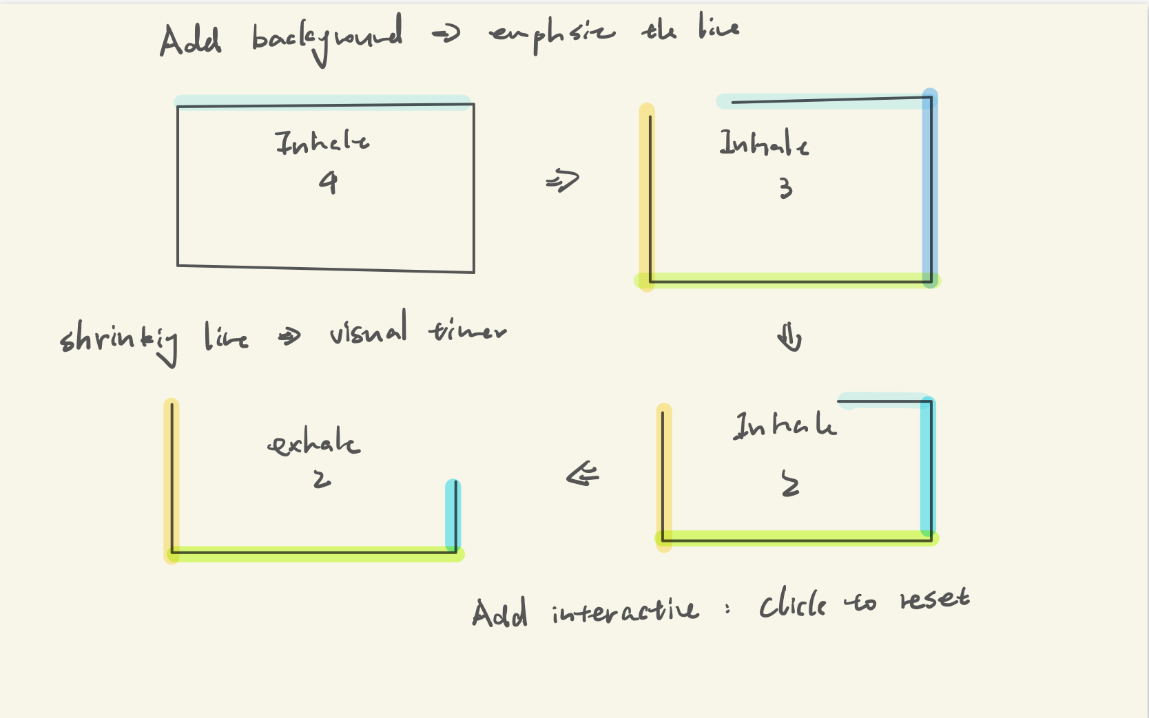
Design process: Driven by the goal to mitigate "time blindness" for the people who want to improve their time efficiency, this clock transforms abstract time into a tangible quantized grid system. The design evolved from traditional clock sketches to a 3,600-cell grid, converting the mental task of "calculating time" into the visual act of "observing volume" to show how an hour is consumed.
I applied several information visualization principles to the final form: I added a semi-transparent dark mask over the grid background to ensure the digital time and progress percentage remain the focal point and are legible regardless of the underlying cell colors. The progress bar uses high-contrast bright yellow against an hour-mapped background hue. This provides a clear visual anchor to capture progress instantly while reducing cognitive load. A dynamic pulse on the current second's cell grounds the user's attention in the "now." This rhythmic motion serves as a visual heartbeat, helping to alleviate anxiety associated with the passage of time.
Key Design Decisions: Breaking the hour into physical units makes time "weighty" and intuitive, removing the need for mental math. The semi-transparent mask effectively filters out visual noise from the background grid, prioritizing core information. And combining a volumetric grid with a linear progress bar provides two ways to interpret time, supporting different cognitive processing styles.
Self-reflection / future work: I might add the ability for users to click and drag over the grid to reserve blocks of cells for specific tasks, changing their color manually. While the current clock is excellent for passive observation, adding an interactive planning layer would turn the clock into an active productivity tool.